Dark surfaces are the most requested and most frequently regretted specification in premium interiors. The regret is rarely about the colour — it is about the room the colour was put into. Deep tones need particular conditions, and given them they produce interiors nothing pale can match.
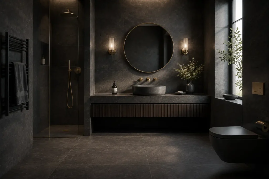
Dark Rooms Want Dark Surfaces
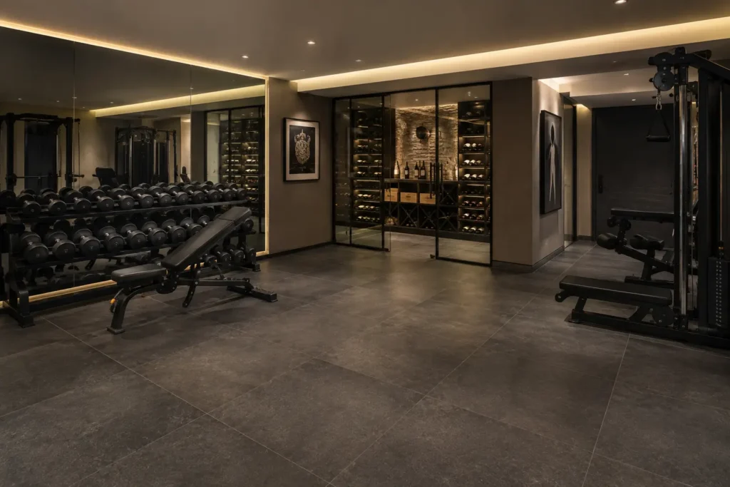
The counterintuitive rule is that a dim room handles dark tiles better than a bright one. A north-facing cloakroom or a windowless Belgravia basement corridor will never read as light however pale the finish; fighting that produces a grey, apologetic space. Lean into it instead — a deep charcoal or near-black surface with good artificial lighting reads as deliberate and enveloping, and the eye stops looking for daylight. In a bright Mayfair reception room with tall sash windows, the same tile is dramatic rather than defensive.
Room size matters less than most people assume. A small cloakroom in a deep tone often feels like a jewel box; a large space in the same colour needs considerably more light to avoid feeling cavernous. Scale governs the lighting budget, not the colour decision.
Finish Matters More Than Colour
A dark matt surface absorbs light and shows dust, water marks and footprints with unusual clarity. A dark lappato or lightly polished face returns highlights, which gives the surface depth and makes marks far less visible. For dark floors in particular, semi-polished is almost always the better specification — and it is why so many dark matt bathroom floors disappoint their owners within a month.
One Dark Plane, Not Four
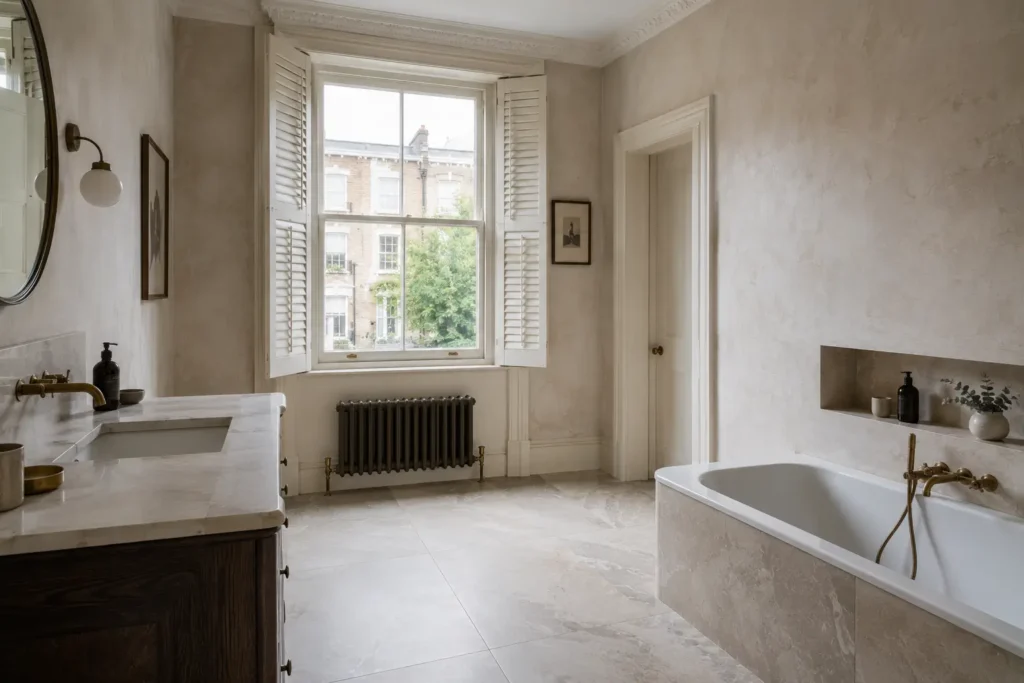
The reliable composition is a single dark surface set against pale or neutral company: a charcoal floor with plaster walls, or a dark shower wall in an otherwise light bathroom. Wrapping a small room entirely in a deep tone works only where lighting has been designed for it — layered, warm and dimmable, with light washing the walls rather than falling from a central fitting.
What to Pair It With
Deep tones want warmth beside them: brushed brass or bronze rather than chrome, oak or walnut rather than white lacquer, linen and wool rather than gloss. Against those, a dark surface reads as considered. Against cool white and polished chrome, it reads as cold.
Grout follows the same logic. Matched dark grout is essential — a pale joint against a near-black tile turns a sophisticated surface into a grid, and is the single most common way a dark scheme is undone.
We keep our darker collections displayed under both daylight and warm artificial light — the difference between the two is the whole decision.