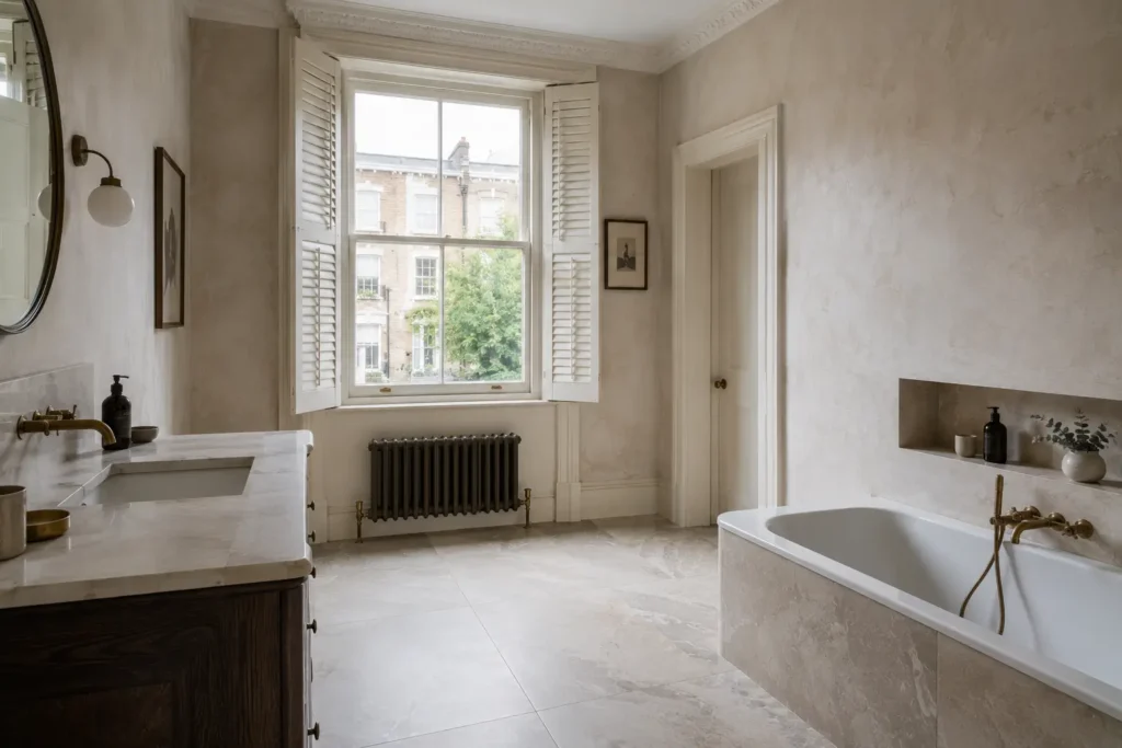
Premium specification has been overwhelmingly neutral for a decade — stone, concrete, marble, greige. Colour is returning, and returning carefully: deep greens, muted blues, clay and terracotta tones rather than the saturated primaries of the previous cycle. Used well, colour is the fastest way to make a room feel authored rather than assembled.
Colour Belongs in Rooms You Pass Through
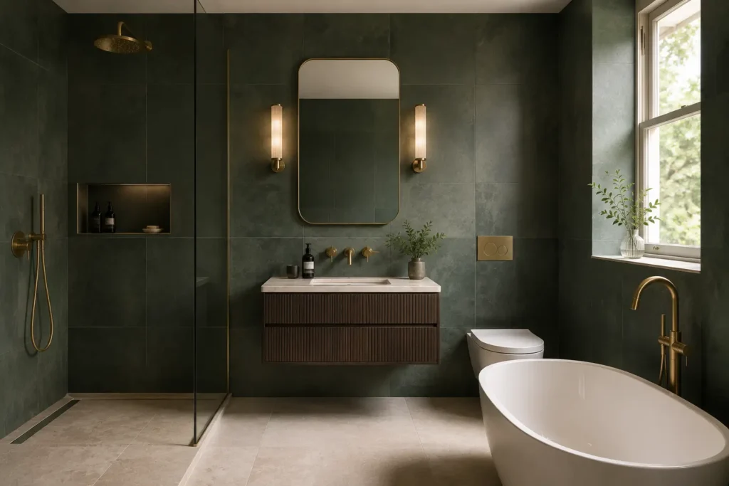
The same logic that governs pattern governs colour. Cloakrooms, guest bathrooms, utility rooms, boot rooms and pantries carry strong colour comfortably because exposure is brief. Principal bathrooms and kitchens — rooms occupied daily for years and expensive to change — are where restraint pays. A deep green cloakroom in a Fulham house is a pleasure; the same green across a family kitchen is a commitment few clients want to renew in five years.
What London Light Does to Colour
Northern light is cool and grey, and it pulls colour toward its cooler edge. A green that reads as warm olive in a Spanish showroom will read as sage or even grey-green in a north-facing Marylebone bathroom. Blues cool toward slate; terracottas lose their warmth and can turn dusty. The remedy is not to avoid colour but to select one step warmer than intended, and always to view samples in the room itself at more than one hour of the day.
Artificial light compounds it. A colour chosen under showroom lighting at 4000K will look different under a warm 2700K domestic scheme — usually better, but confirm rather than assume.
Saturation and Finish
Muted, complex colours age far better than saturated ones. A green with grey in it, a blue with green in it, a terracotta with clay rather than orange — these read as considered and sit alongside natural materials. Finish matters as much: a glossy coloured tile is emphatic and reflective; the same colour in matt or lightly textured reads as pigment in plaster, which is almost always the calmer choice for a large area.
What to Pair It With
Give colour quiet company. One coloured surface, plain walls elsewhere, one metal finish, and natural materials — oak, linen, unlacquered brass — around it. Deep green and brushed brass, muted blue and pale stone, terracotta and warm timber are pairings that have survived several cycles because they are grounded in material rather than trend.
One further consideration is resale. Colour is personal, and prime London property is frequently sold within a decade. Confining strong colour to rooms that can be changed cheaply — a cloakroom, a utility — protects both the pleasure of it now and the flexibility later. In principal rooms, colour is better introduced through paint, textile and art than through a tiled surface.
We keep coloured collections displayed alongside our neutrals — seeing them together is the quickest way to judge how much colour a scheme can carry.