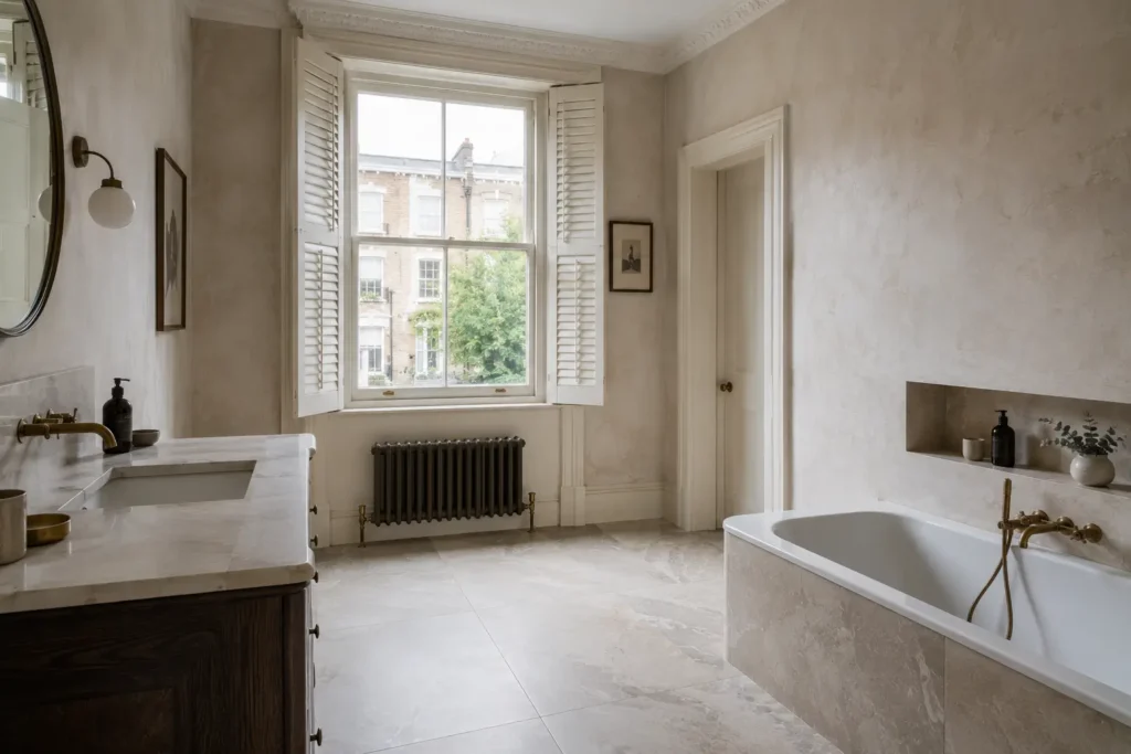
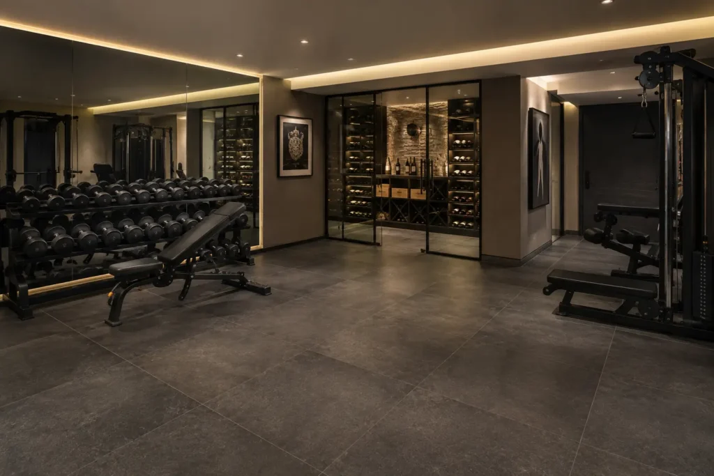
A tile is never chosen alone. It sits against cabinetry, metalwork, paint, glass and textile, and its success is measured entirely by that company. The most common specification error is selecting each element in isolation and hoping — a process that produces rooms where everything is individually good and collectively wrong.
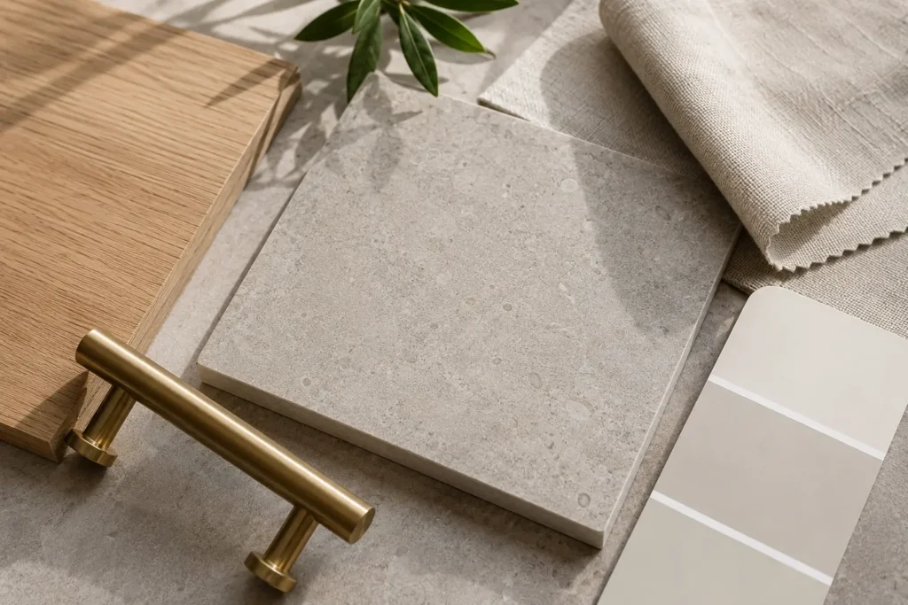
Undertone Is the Governing Variable
Every neutral has a bias: warm toward yellow, red or brown; cool toward blue, green or grey. Two greys that look identical on a sample board can clash badly across a room because one leans blue and the other leans brown. Establish the undertone of the tile first, then select everything else to the same bias. This one discipline resolves most material conflicts before they arise, and it is what makes a Belgravia bathroom in five materials read as one decision.
The reliable test: place the sample against a sheet of pure white paper. The bias becomes obvious immediately, in a way it never is against a coloured surface.
Timber and Stone Effects
Oak is the default London joinery timber and reads warm, with a yellow-to-gold bias. It pairs naturally with warm greige, travertine and honeyed stone effects, and fights cool blue-greys. Walnut is deeper and redder, and sits well against darker stone and concrete effects. Painted joinery in an off-white is more forgiving, but only if its undertone matches — a warm tile against a cool brilliant white looks dirty rather than warm.
Metalwork
Metal finish is the fastest way to shift a scheme’s temperature. Brushed brass and bronze warm cool surfaces and are the reliable partner for concrete, grey stone and dark tones. Chrome and polished nickel are neutral and disappear, which is useful when the surfaces should carry the room. Matt black is graphic and reads best against pale, plain surfaces. The rule that matters more than the choice: repeat one finish throughout a room — taps, waste, shower, accessories, handles, lighting — because inconsistency here reads as unresolved rather than eclectic.
Paint, Last
Paint is the cheapest element to change and should therefore be selected last, against the tile rather than before it. Bring the actual sample to the paint selection, not a photograph. And test the colour on the wall adjoining the tiled surface, at the height it will be seen, in the room’s own light — a Notting Hill bathroom and a Hampstead one will make the same pair behave differently.
Assemble everything physically before committing. A material board with the actual tile, timber, metal, paint and textile laid together, viewed in the room itself, resolves in ten minutes what weeks of individual selection cannot. We keep a table in the showroom for exactly this, and clients who use it rarely change their minds later.
Bring your joinery samples and metalwork to the showroom and we will build the palette against the actual material.